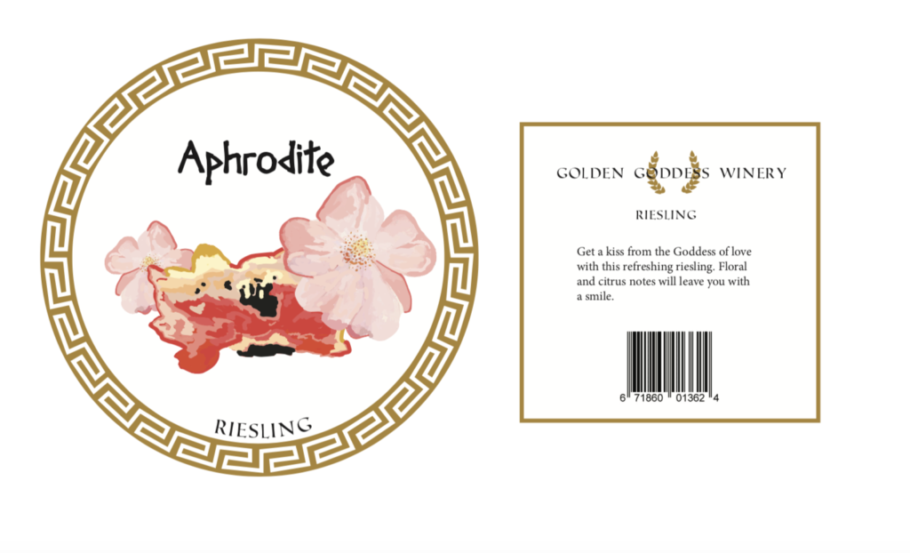
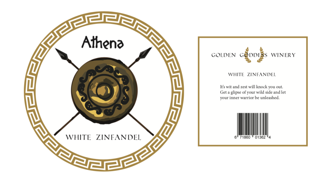
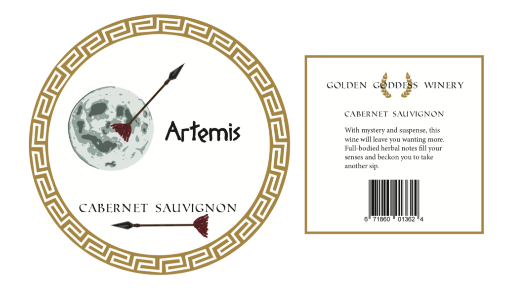
This wine brand is based on the Greek Goddesses. I was inspired by my trip to Greece a couple of years ago and wanted to show a new version of representing them through my own work. The typefaces that I chose were very classically greek. I used gold to go along with my company name, and used a laurel leaf crown as the logo since it is a major greek symbol that is often depicted on the heads of Gods and Goddesses with the highest honor.
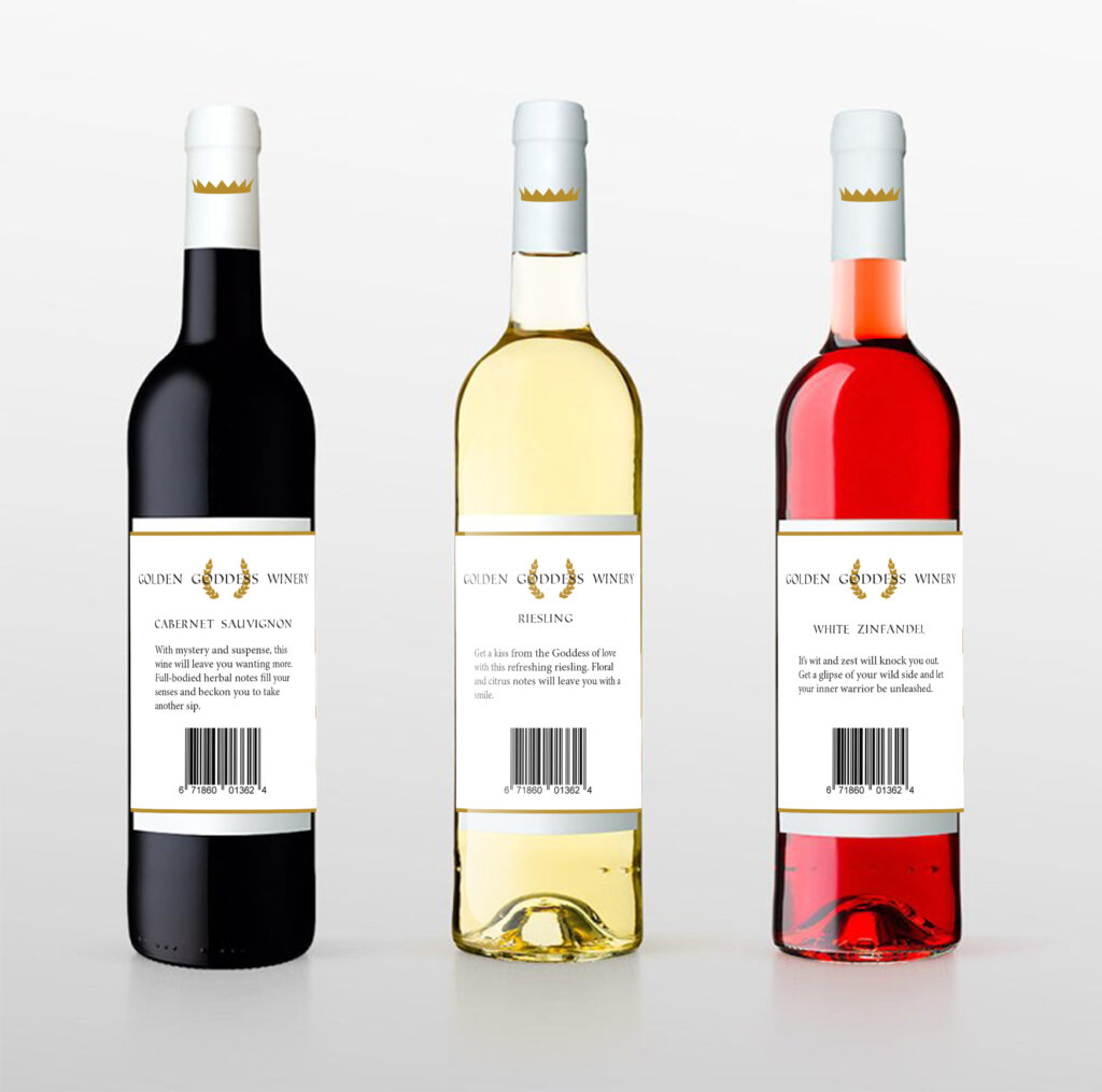
Through my project I created a certain consistency in my brand. I had the golden geometric border around the front of the bottle and the thin one around the back. The same typeface was used for the names of the wine, the kinds of wine that each bottle held, and the text that was on the back of each label. I also used graphics that represented each goddess but had the same style of illustration. I stuck with using the same gold color throughout the logo and borders which contributed to a unified brand.
I was able to make each bottle unique by the visuals that went on the front label. This went along with how I matched the kind of wine to the figure that I wanted to represent. I also was able to make the descriptions of the wine simple, and correlated the goddess to the type of wine, and used it to entice people to drink my products.